Interesting seeing how you've been working with this lately. I do think though you litterally need to think outside the box - at the moment that is seriously limiting your creativity and I do think the BBC logo is strong enough that it doesn't need to be boxed in to work in a generic sense. Those three blocks can link together everything the BBC does without the need for further elements common to all logos.
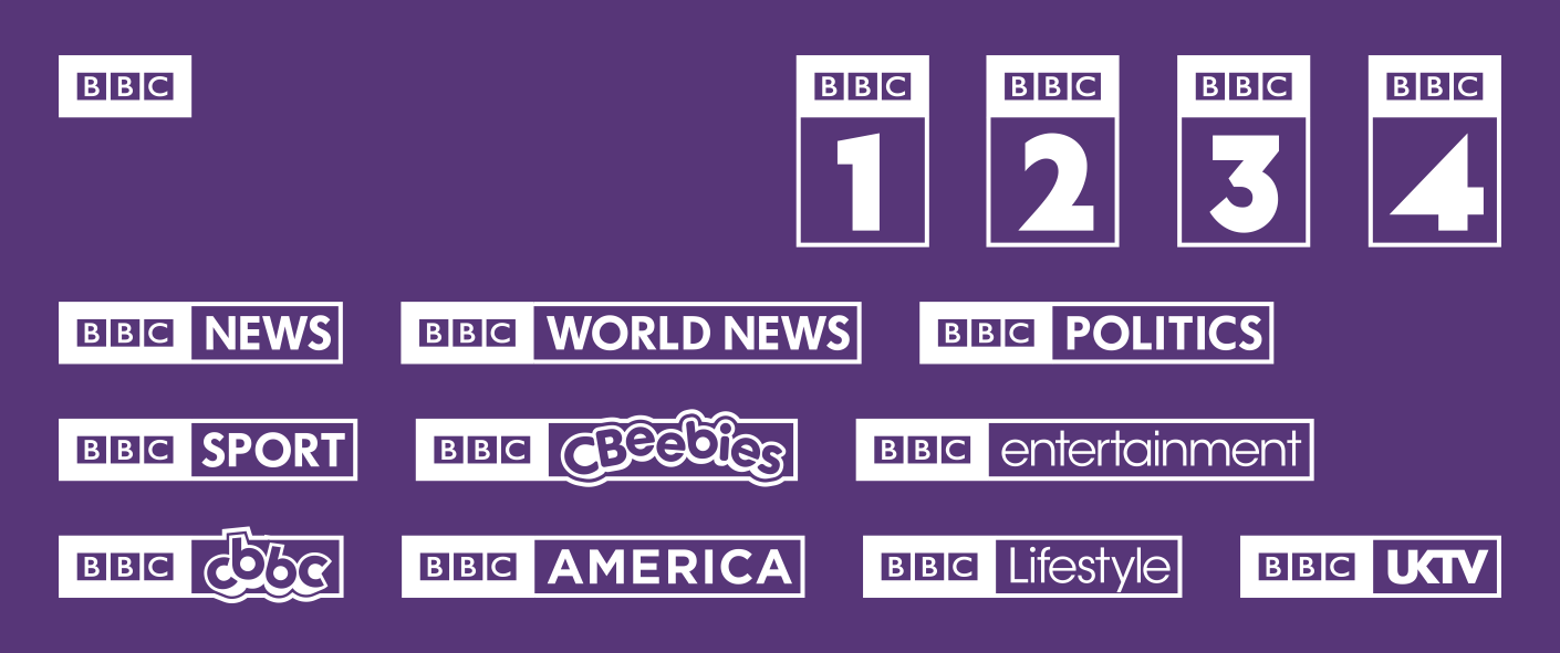
Indeed IMO the problem with the current look is more about the channels the box the logo than the channels that don't. The current BBC One and BBC Three logos look pretty good, as do CBBC and CBeebies - while BBC2 is just a one big mess - I do think the BBC logo with just the "2" could work and sit well enough alongside the text based logo.
The enclosures have been put there to help contain elements, and help with optical balancing etc. And these past few ideas are ideas I am trying and ruling out.
The BBC logo just tagged on randomly with random fonts/logos is something I am not keen on, and I am trying to work toward a consistent arrangement of BBC and the other element.
Then with the logos I came up with for the video mock, the negative comments were about things not feeling balanced, placement of HD symbols, logos not feeling strong enough, couldn't be seen as appearing on air.
I think I am done exploring these options now, and I think I need more feedback about specific good points from each of the ideas I have posted, before I can start exploring the possible ideas.
Do I need to start from scratch, or do I take the logos from the video mock, and work on those?
If I do go back to the video logo ideas, what needs to be changed with them?
Has there been anything you have all seen from the subsequent ideas (colours, fonts, kerning, balance, sizing, orientation, etc) that should be explored with the earlier logos?