JD
JDN
And please, the square logos are better than the old BBC boxes. Please do away with the old shape boxes.
Nope. I've tried but even though the words are going into my brain there's no way it'll be able to compute why anybody would think that.

The proper version is just clearly much better in every way.
Sorry, I didn't mean the logo. Sorry if I gave the wrong impression.
IA
Right, Okay so I've been trying to figure a new logo for each channel but where they all match each other, so here is
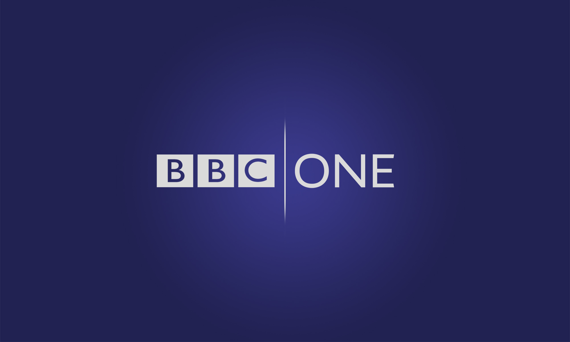
BBC ONE
So for the BBC ONE logo I decided to change the colour to blue as it'a a more calming/bold colour & I think that's what BBC ONE represents.
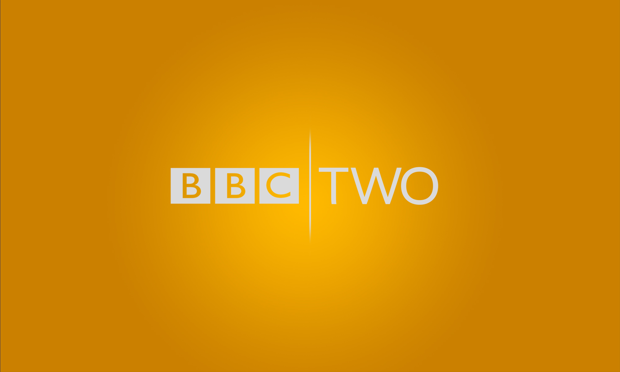
BBC TWO
With this I decided to take the colour back to the one yellow which was used in the 90's as BBC TWI is seen sometimes as a sort of retro channel.
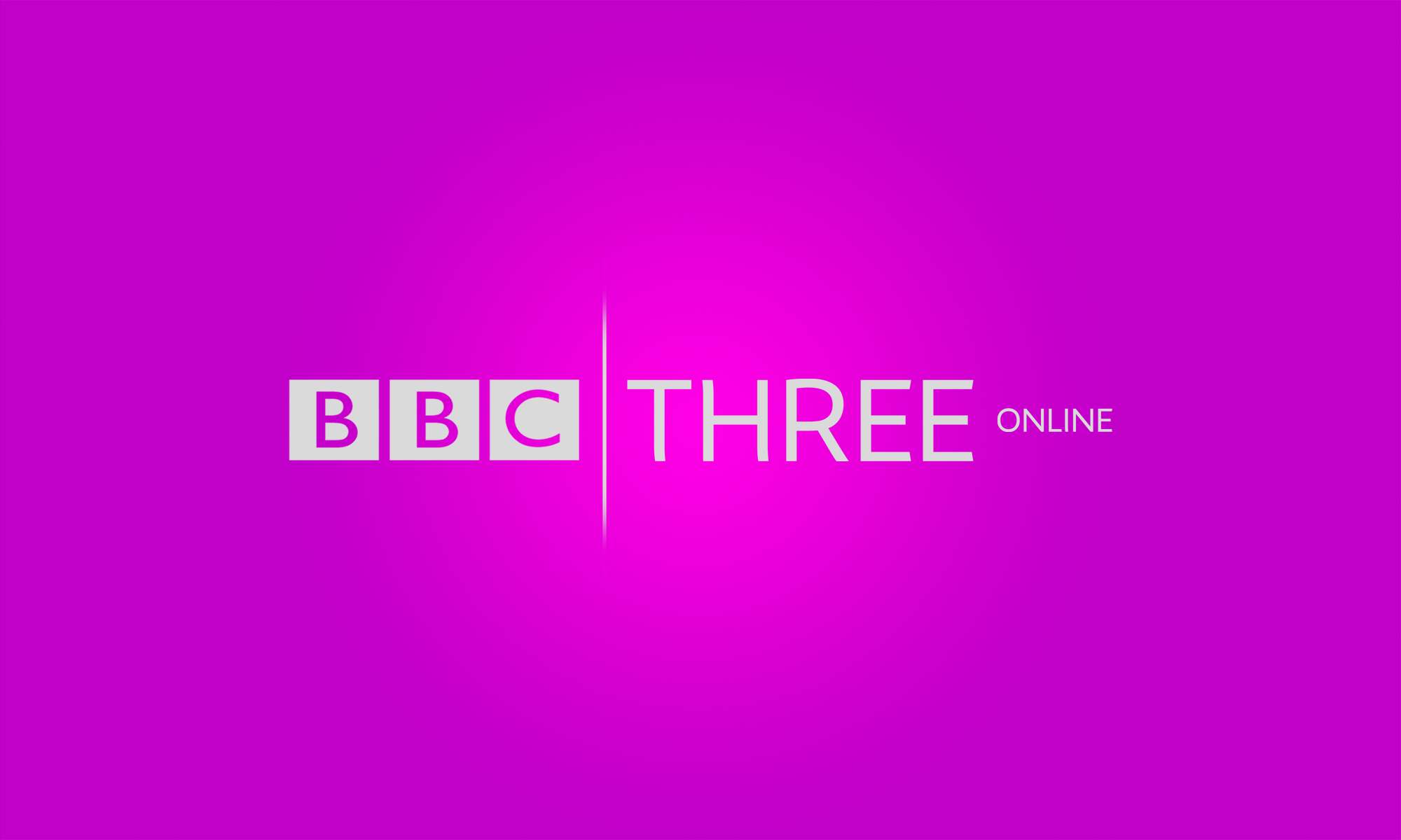
BBC THREE online
For this I decided to stick with the pink they use now.
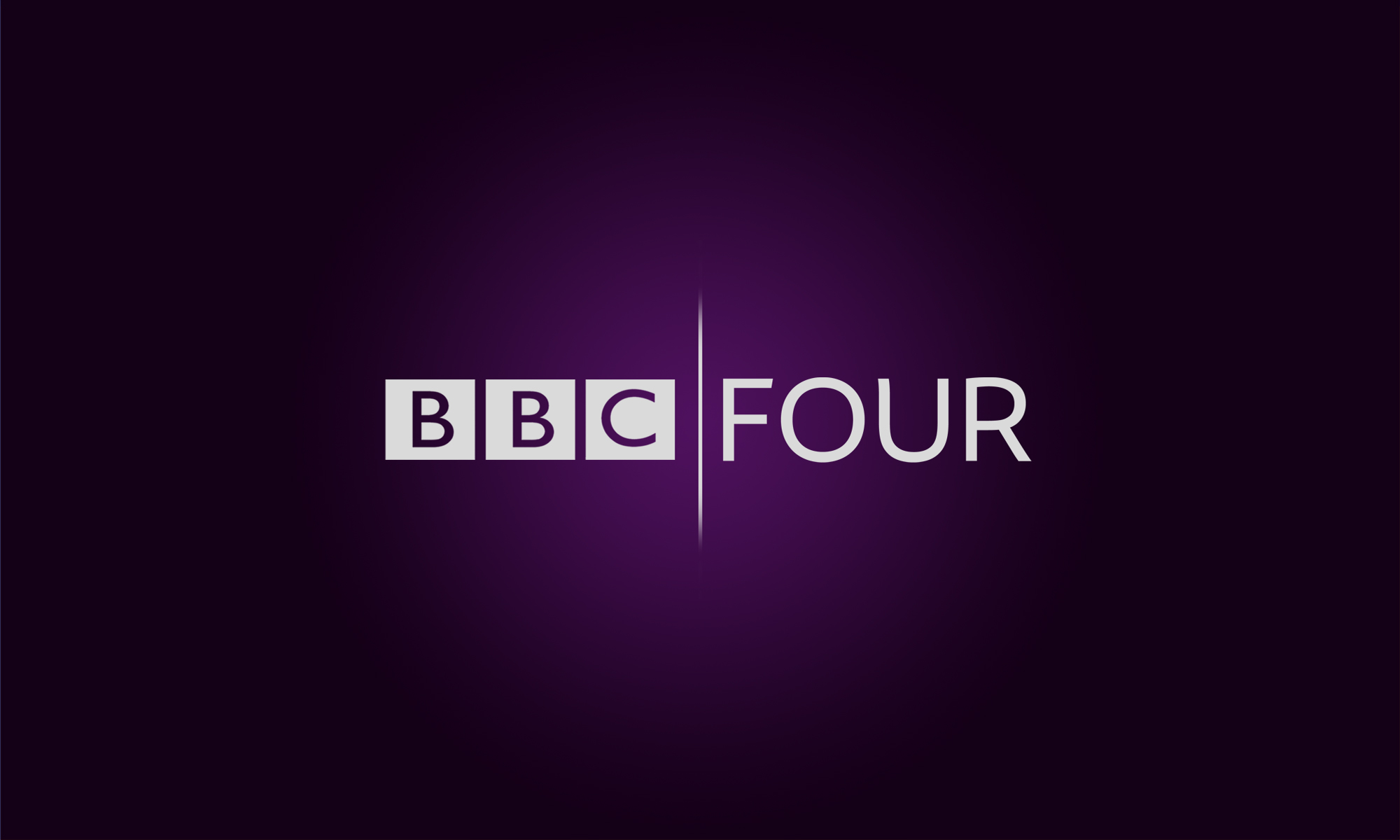
BBC FOUR
This channel needed a change of colour so keeping with the dark theme of the present I made this a dark purple which to me still represents BBC FOUR's programming.
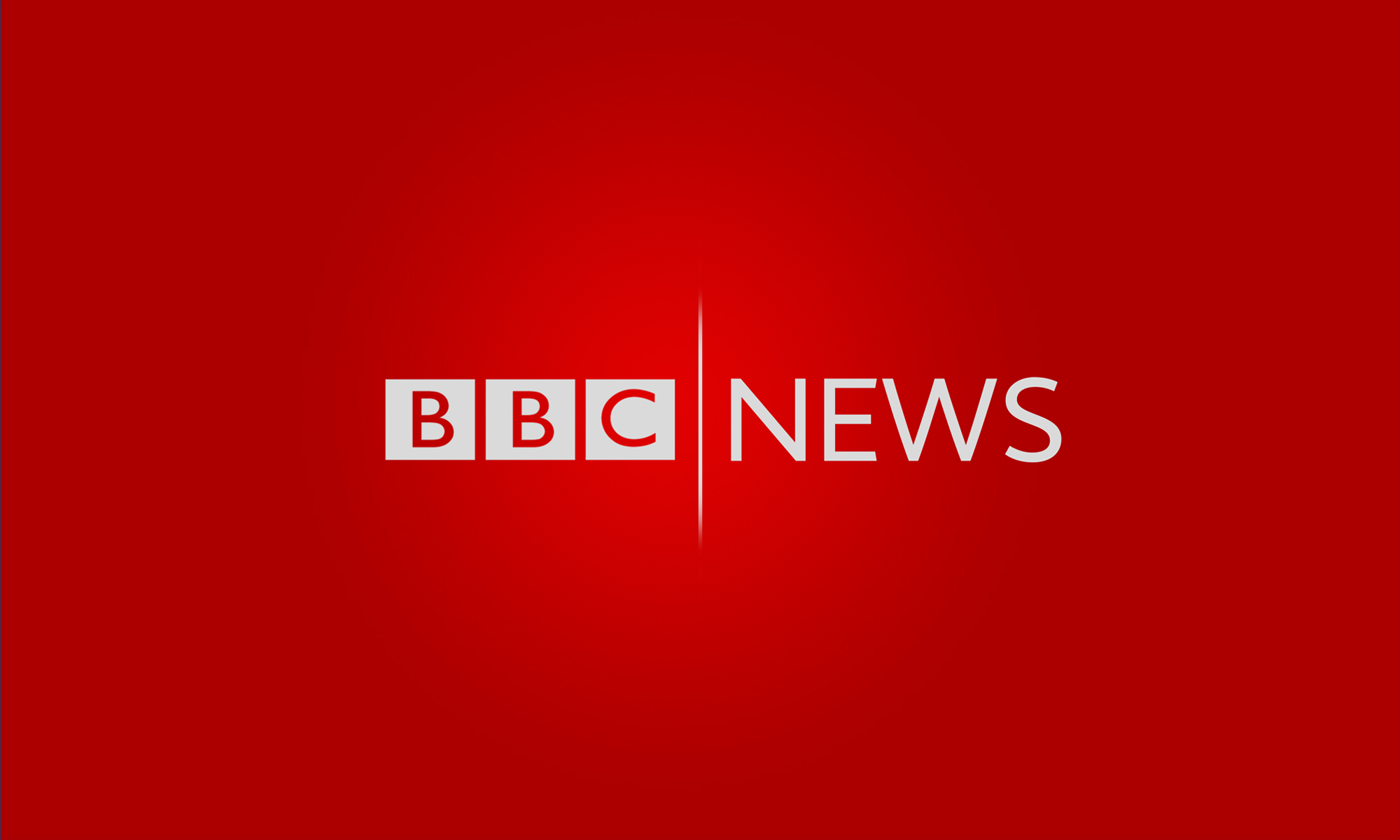
BBC NEWS
This same as BBC THREE hasn't changed colour & is still red. (It's taken the present BBC ONE colouring). I've always thought that red suited news channels/reports.
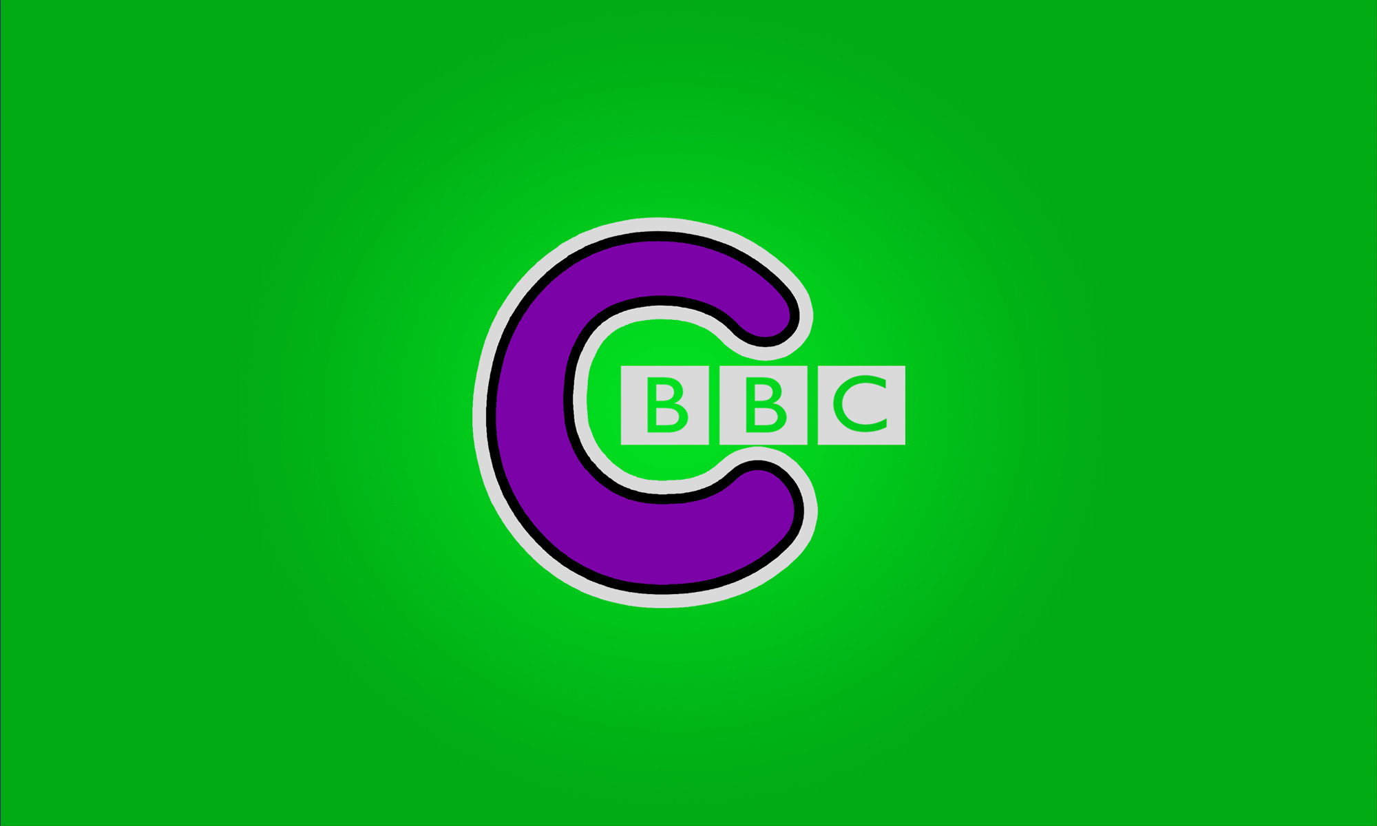
CBBC
So for this one I took it back to the one they had in the early 00's it's the one I grew up with. I love the C!
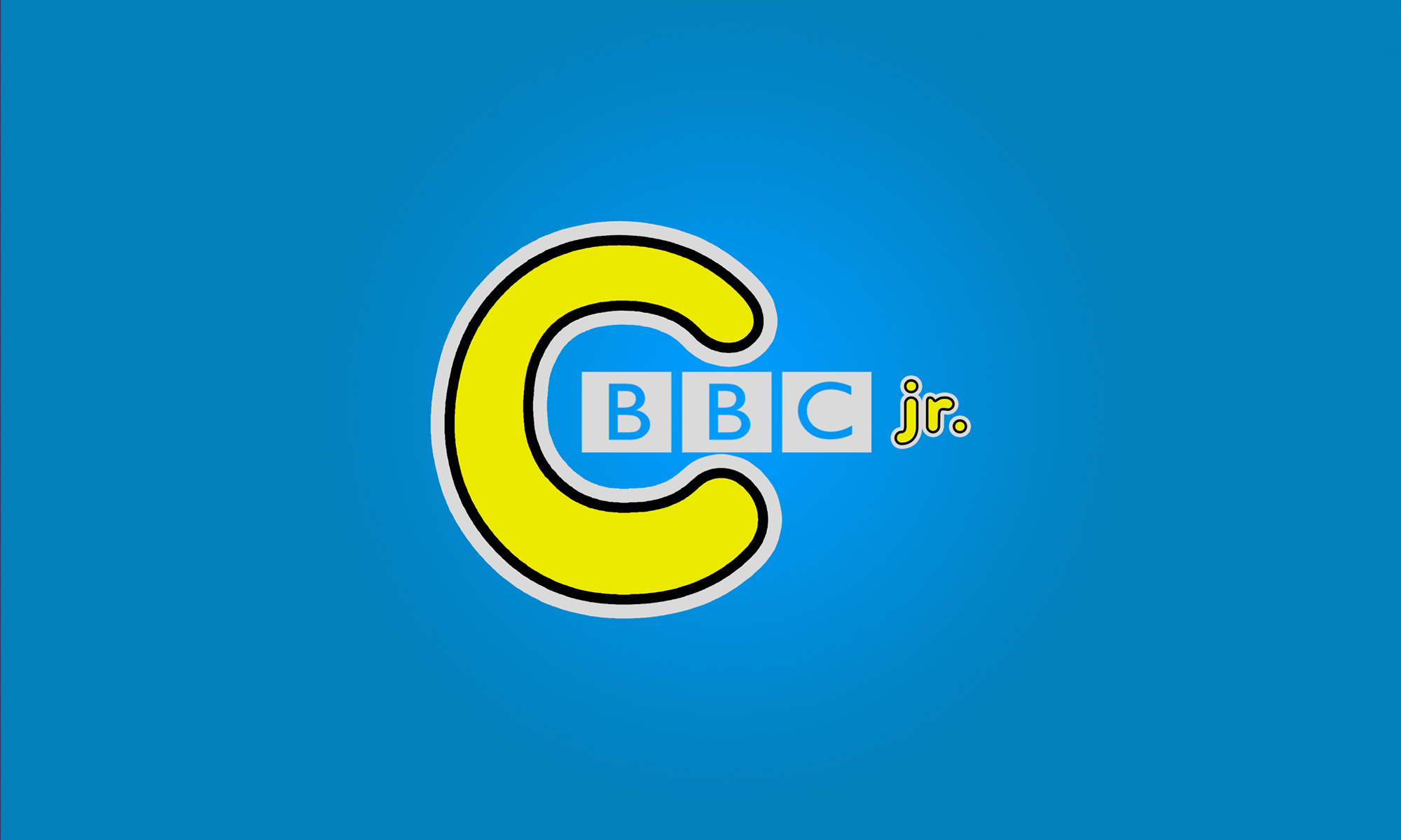
CBBC jr.
This is the only channel to get an updated name. The original channel is of course Cbeebies. I've seen over user change it to this & I liked the idea. For this I used the same C as CBBC with the jr. as a font that look similar.
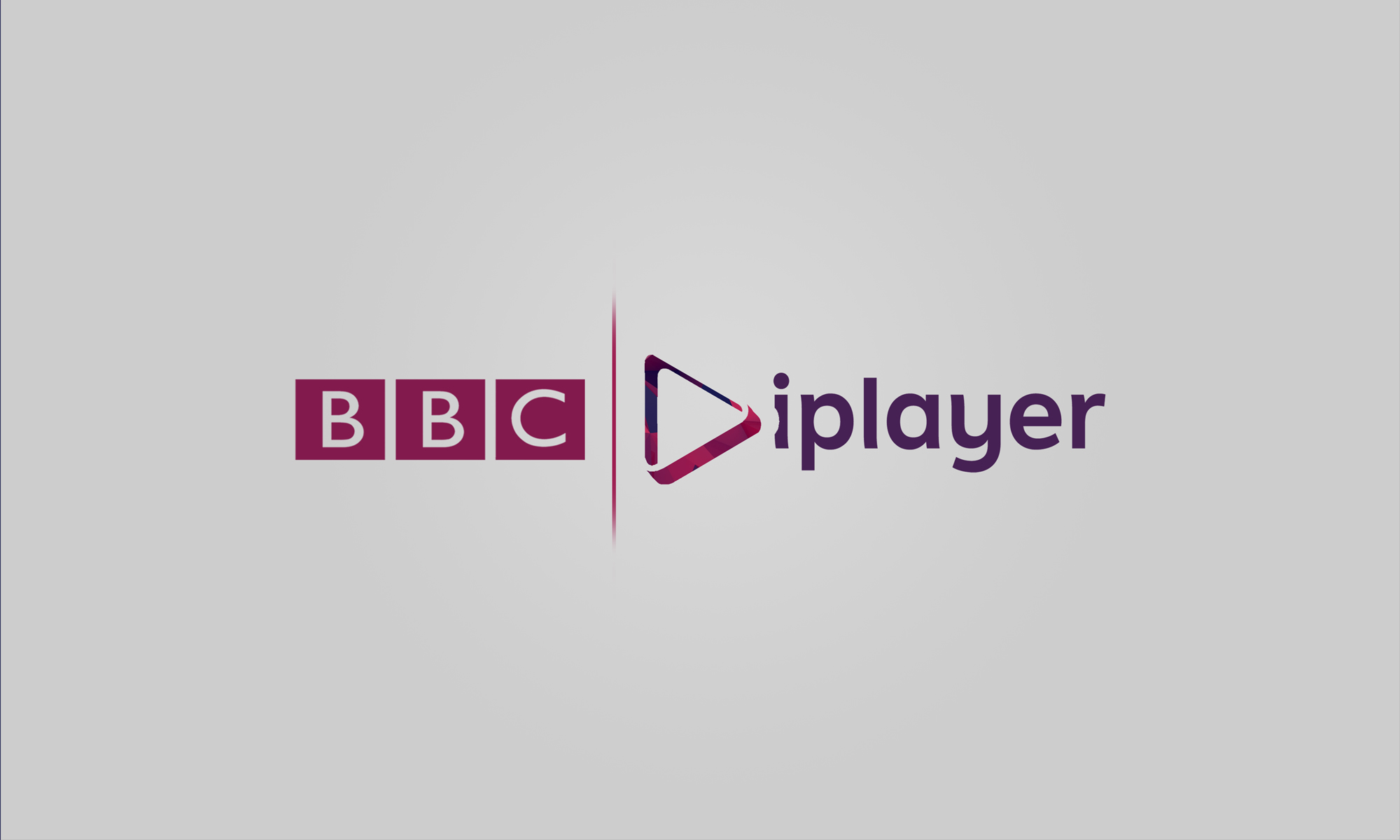
BBC iplayer
This is the same as my earlier logos with the same as the other logos here ^^ to tie it all in.
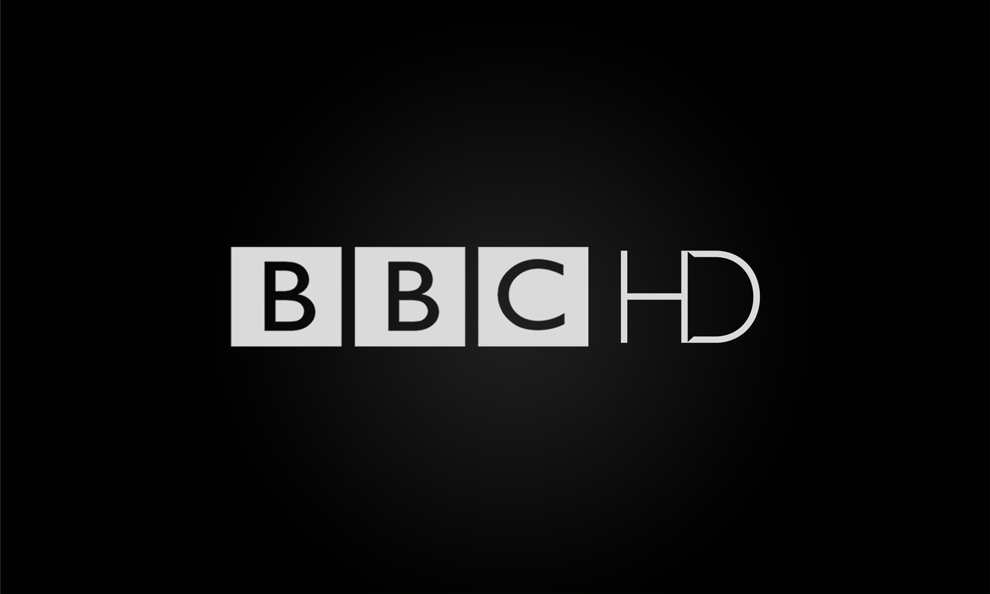
BBC HD
This is nothing special I thought I'd make one so people had an understanding as how the HD logo would look.
Please be as harsh or nice as you want
I hope the one's of you who didn't like my previous stuff think I've improved!
Thank you for taking the time to have a look!
BBC ONE
So for the BBC ONE logo I decided to change the colour to blue as it'a a more calming/bold colour & I think that's what BBC ONE represents.
BBC TWO
With this I decided to take the colour back to the one yellow which was used in the 90's as BBC TWI is seen sometimes as a sort of retro channel.
BBC THREE online
For this I decided to stick with the pink they use now.
BBC FOUR
This channel needed a change of colour so keeping with the dark theme of the present I made this a dark purple which to me still represents BBC FOUR's programming.
BBC NEWS
This same as BBC THREE hasn't changed colour & is still red. (It's taken the present BBC ONE colouring). I've always thought that red suited news channels/reports.
CBBC
So for this one I took it back to the one they had in the early 00's it's the one I grew up with. I love the C!
CBBC jr.
This is the only channel to get an updated name. The original channel is of course Cbeebies. I've seen over user change it to this & I liked the idea. For this I used the same C as CBBC with the jr. as a font that look similar.
BBC iplayer
This is the same as my earlier logos with the same as the other logos here ^^ to tie it all in.
BBC HD
This is nothing special I thought I'd make one so people had an understanding as how the HD logo would look.
Please be as harsh or nice as you want
I hope the one's of you who didn't like my previous stuff think I've improved!
Thank you for taking the time to have a look!
DT
The only improvement I can see is the fact that you are using the proper BBC logo, but aside from that they just seem bland and uniform - uniformity can be good, look at what Lambie-Nairn did, but the way he used the logos was anything but uniform. The logo shouldn't form the basis of the identity, it should be part of the identity. Your description of the colours is bizarre and is basically 'I chose colour X because it suits brand Y', and the description of BBC Two as a retro channel is baffling - how is BBC Two a retro channel - sure it plays repeats of old programmes during the daytime but its prime time is primarily new content (also Yellow was used in the early 00s, Viridian was the colour they used in the 90s). Given CBeebies is one of the strongest BBC brands, and almost unchanged since its launch almost 15 years ago, why would you change it to CBBC jr.
Also you've, like most 'total BBC overhauls' on the gallery, have only done half the channels. If you're going to refresh BBC News then what about BBC Parliament and BBC World News as well as the other BBC News outlets that follow the BBC News branding such as the World Service. You've rebranded BBC HD which is now only a BBC Worldwide channel, what about the other BBC Worldwide channels? Also what about the other BBC core brands, like BBC Sport and BBC Weather etc. - if this is a 'total' overhaul then surely the should be in on the action too.
Also you've, like most 'total BBC overhauls' on the gallery, have only done half the channels. If you're going to refresh BBC News then what about BBC Parliament and BBC World News as well as the other BBC News outlets that follow the BBC News branding such as the World Service. You've rebranded BBC HD which is now only a BBC Worldwide channel, what about the other BBC Worldwide channels? Also what about the other BBC core brands, like BBC Sport and BBC Weather etc. - if this is a 'total' overhaul then surely the should be in on the action too.


NA
Anything but CBBC Jr... way too Americanised.
This is the only channel to get an updated name. The original channel is of course Cbeebies. I've seen over user change it to this & I liked the idea. For this I used the same C as CBBC with the jr. as a font that look similar.
Anything but CBBC Jr... way too Americanised.
AE
Anything but CBBC Jr... way too Americanised.
Keep All the channel names, not some.
This is the only channel to get an updated name. The original channel is of course Cbeebies. I've seen over user change it to this & I liked the idea. For this I used the same C as CBBC with the jr. as a font that look similar.
Anything but CBBC Jr... way too Americanised.
Keep All the channel names, not some.