BR
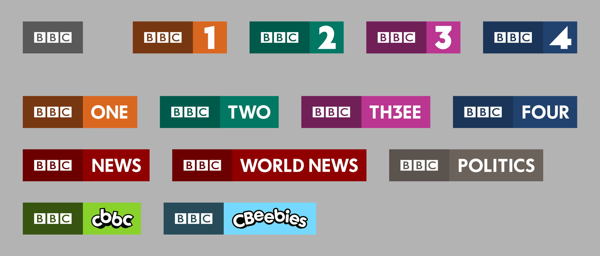
I like - nothing revolutionary but they work well and the squares IMO actually give them a bit more to play with than the simple rectangle - and can be linked back to the BBC blocks.
Wonder how long it'll be until channels stop adding the HD tagline though - don't really think it's necessary anymore on the logos at least.
Wonder how long it'll be until channels stop adding the HD tagline though - don't really think it's necessary anymore on the logos at least.
DA
I do like them, but feel that the channels need something other than a colour to set them apart, could you possible mock up some "mood boards" with patterns/images/ideas that show how each logo and colour would sit within the channels theme/ethos??
:-(
A former member
I think my problem with all of these is that it seems like you are finding it hard to see past the *BBC logo plus channel number/name in plain text* that they currently do. I think I'd like to see a bit more creativity in the individual logos - look at the current BBC Radio logos for example. I think they're great at conveying a different image but all within the same overall branding.
I still think, by the way, that the video of an example of a junction from way back when this thread started was the best I've seen you do. It really is superb.
I still think, by the way, that the video of an example of a junction from way back when this thread started was the best I've seen you do. It really is superb.
JK
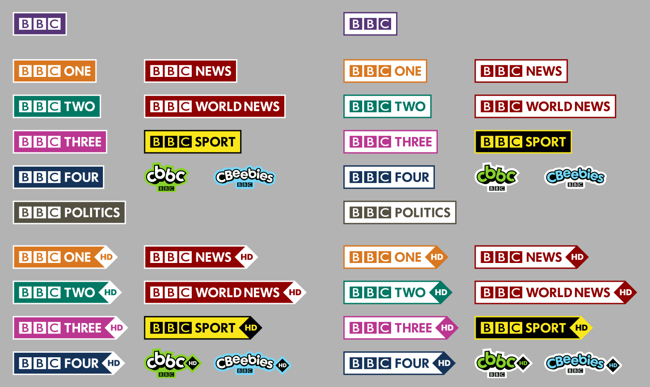
I think that these are the greatest set produced yet. The simplicity and unity of the logos really strengthens the brand. I think that the HD bar at the bottom is the best way to execute this.
I'd say that the pink of the BBC Three logo needs to be more of a 'hot pink', to show it's attitude brashness. As well, perhaps make the blue in the CBeebies logo a tad darker so their is a greater tonal contrast with the yellow. Finally, I agree with BBC News Fix about the iPlayer logo about the 'iPlayer' text being white along with the BBC logo.
Another one to mark off the list of ideas...
I think that these are the greatest set produced yet. The simplicity and unity of the logos really strengthens the brand. I think that the HD bar at the bottom is the best way to execute this.
I'd say that the pink of the BBC Three logo needs to be more of a 'hot pink', to show it's attitude brashness. As well, perhaps make the blue in the CBeebies logo a tad darker so their is a greater tonal contrast with the yellow. Finally, I agree with BBC News Fix about the iPlayer logo about the 'iPlayer' text being white along with the BBC logo.
MD
These past few designs have been to rule out ideas that just don't feel right. I am trying to find a system of making logos that work together.
The radio logos are the saving grace of the current branding, but co-opting them or the numerals for the channels feels wrong, and would not work for channels like CBBC, BBC News, BBC Parliament, BBC iPlayer, or BBC America etc.
Giving each channel their own distinct logo will come down to deciding the brand of each channel, and is not in the scope of my attempts to unify, and modernise all the branding.
Also regarding the junction video, my hope is to do a new version of it, but with branding that people feel they could imagine seeing on air. And logo designs that people feel are superior to what is currently being used. I want to address the problems people had with the last designs, and then see if anyone wants to come up with ideas using the brand system and logos I have designed, for their own mocks.
I think my problem with all of these is that it seems like you are finding it hard to see past the *BBC logo plus channel number/name in plain text* that they currently do. I think I'd like to see a bit more creativity in the individual logos - look at the current BBC Radio logos for example. I think they're great at conveying a different image but all within the same overall branding.
I still think, by the way, that the video of an example of a junction from way back when this thread started was the best I've seen you do. It really is superb.
I still think, by the way, that the video of an example of a junction from way back when this thread started was the best I've seen you do. It really is superb.
These past few designs have been to rule out ideas that just don't feel right. I am trying to find a system of making logos that work together.
The radio logos are the saving grace of the current branding, but co-opting them or the numerals for the channels feels wrong, and would not work for channels like CBBC, BBC News, BBC Parliament, BBC iPlayer, or BBC America etc.
Giving each channel their own distinct logo will come down to deciding the brand of each channel, and is not in the scope of my attempts to unify, and modernise all the branding.
Also regarding the junction video, my hope is to do a new version of it, but with branding that people feel they could imagine seeing on air. And logo designs that people feel are superior to what is currently being used. I want to address the problems people had with the last designs, and then see if anyone wants to come up with ideas using the brand system and logos I have designed, for their own mocks.
Last edited by mdtauk on 12 December 2013 10:50am
MD
Thank you for once again commenting on my numerous BBC Logo mock ideas. I am making slow steps because I am not as enthused as I was before. Like getting back on the bike after falling off.
You seem to be one of the few voices suggesting I move back more towards the ideas in the first Video. So I was wondering if you would be willing to let me know what you liked about them, where they fall short, and where I went wrong approaching that video, and what happened following the feedback from them.
I re-read the whole thread today, hoping to see where I went wrong in listening to the feedback. Was I misreading the comments etc. I want to produce a set of logos which follow a system, work for all the channels, look like they belong together, and give designers scope to implement them for each channel's own theme and branding.
Some logo families I have been looking at for ideas are here
http://www.underconsideration.com/brandnew/archives/danish_broadcasting_all_logos_p1-p8.gif
http://www.underconsideration.com/brandnew/archives/nick_nickelodeon_family.gif
http://www.underconsideration.com/brandnew/archives/mtv_fi_followup_all_logos.png

http://en.glaz.tv/images/logos/tv/big/amc.jpg
I think my problem with all of these is that it seems like you are finding it hard to see past the *BBC logo plus channel number/name in plain text* that they currently do. I think I'd like to see a bit more creativity in the individual logos - look at the current BBC Radio logos for example. I think they're great at conveying a different image but all within the same overall branding.
I still think, by the way, that the video of an example of a junction from way back when this thread started was the best I've seen you do. It really is superb.
I still think, by the way, that the video of an example of a junction from way back when this thread started was the best I've seen you do. It really is superb.
Thank you for once again commenting on my numerous BBC Logo mock ideas. I am making slow steps because I am not as enthused as I was before. Like getting back on the bike after falling off.
You seem to be one of the few voices suggesting I move back more towards the ideas in the first Video. So I was wondering if you would be willing to let me know what you liked about them, where they fall short, and where I went wrong approaching that video, and what happened following the feedback from them.
I re-read the whole thread today, hoping to see where I went wrong in listening to the feedback. Was I misreading the comments etc. I want to produce a set of logos which follow a system, work for all the channels, look like they belong together, and give designers scope to implement them for each channel's own theme and branding.
Some logo families I have been looking at for ideas are here
http://www.underconsideration.com/brandnew/archives/danish_broadcasting_all_logos_p1-p8.gif
http://www.underconsideration.com/brandnew/archives/nick_nickelodeon_family.gif
http://www.underconsideration.com/brandnew/archives/mtv_fi_followup_all_logos.png
http://en.glaz.tv/images/logos/tv/big/amc.jpg
Last edited by mdtauk on 13 December 2013 1:50pm